Is it difficult to assess the availability of your resources?
Are you struggling to optimize workforce utilization in real time?
Is uneven workload distribution affecting productivity and operational efficiency?
These are common challenges for businesses that lack comprehensive visibility of resources and their utilization across various projects and functional areas. This inadequacy often leads to burnout, disengagement, compromised work quality, and delays. In this scenario, a resource heatmap can become an invaluable tool.
A resource heatmap provides a real-time overview of utilization, making it easy for managers to identify imbalances at a glance. This insight allows them to take corrective action to prevent over/underutilization and maintain high productivity levels.
Moreover, resource heatmaps support long-term workforce planning. By analyzing utilization trends, managers can forecast capacity needs, make data-driven staffing decisions, and prevent resource bottlenecks before they impact project timelines. This way, firms can streamline operations, improve project outcomes, and maximize team performance.
This blog discusses resource heatmaps, their key components, their benefits, and how to create one.

What is a Resource Heatmap?
A resource heatmap is a visual representation of how effectively resources are allocated against their capacity or availability. It typically uses color gradients to depict different levels of utilization across various dimensions such as role, team, department, location, etc. The heatmap enables users to identify and address instances of over- and underutilization and maintain optimum productivity.
Now that we know what is a resource heatmap, let’s explore a relevant example:
In a mid-sized IT services firm, the network operations team is working across multiple projects. The manager leverages a resource heatmap to assess workload distribution over the next two weeks and uncovers the following:
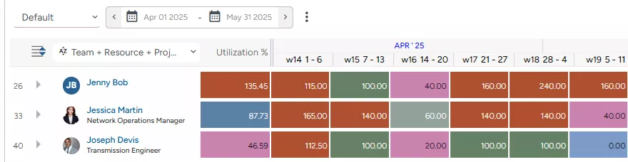
Jenny, a senior Field Engineer, is booked at 135.45 % of her capacity, indicating overutilization. She is simultaneously assigned to two active projects while supporting a high-priority initiative. On the heatmap, the cells corresponding to Week 14 and Weeks 17 through 19 are highlighted in red, signaling a workload spike.
Joseph, a mid-level transmission engineer, is booked at only 46.59 % of his capacity. He was overutilized in Week 14, with the corresponding cell on the heatmap marked in red. While optimally utilized in Weeks 15, 17, and 18 (cells marked in green), he shows underutilization in Week 2, highlighted in pink, a trend that can lead to reduced productivity and lower profitability.
Thus, using these insights, the manager can take necessary resourcing measures to optimize employee workloads, boost productivity, and maintain a healthy resource utilization index across the team.
Note: Heatmaps use colors to represent different ranges of resource utilization and can be configured based on organizational preferences. Additionally, thresholds for over-, under-, and optimal utilization may vary depending on the firm and the industry.

Now that we have covered the definition, let’s take a closer look at their different types.
Types of Resource Heatmap
Resource heatmaps come in different types, each serving a specific purpose. They are:
Overall
An overall resource heatmap offers a high-level view of resource utilization across departments, teams, and projects. It highlights overall workload distribution, making it easier to swiftly identify overused or underutilized resources. This enables managers to make informed decisions to balance workloads & enhance the resource health index.
Strategic
A strategic heatmap visually represents the amount of time resources spend toward high-priority, strategic initiatives. It measures their utilization levels when engaged in these key activities, which are crucial for achieving the organization’s long-term objectives and driving business growth.
Billable
A billable resource heatmap illustrates how much time resources spend on revenue-generating projects against their capacity or availability. It offers clear visibility into billable hours, that is, the time spent on activities that can be directly invoiced to the client. The goal is to maximize billable hours to boost overall business profitability.
Non-Billable
A non-billable resource heatmap tracks and highlights the time resources spend on activities that are not billed to the client. This includes BAU tasks, administrative work, internal meetings, support maintenance work, etc. Generally, firms try to minimize non-billable hours as much as possible.
Read More: Key Differences Between Billable & Non-Billable Work and Its Importance
Having understood its types, let’s explore its key components.
Key Components of Resource Utilization Heatmap
Resource heatmaps consist of various components that help visualize and analyze utilization effectively. Let’s understand in detail.
Color Codes
The resource heat maps use color coding to represent different levels of resource utilization, as shown below. However, these color codes are generally customizable and can be tailored to reflect specific utilization thresholds per business requirements.
- Red – Overutilized, carrying excessive workload.
- Pink – Underutilized, not fully engaged.
- Dark Grey – Averagely utilized, the workload is balanced.
- Green/Dark Green – Optimally utilized, working at peak efficiency.
- Light Blue – Not utilized and are available for tasks.
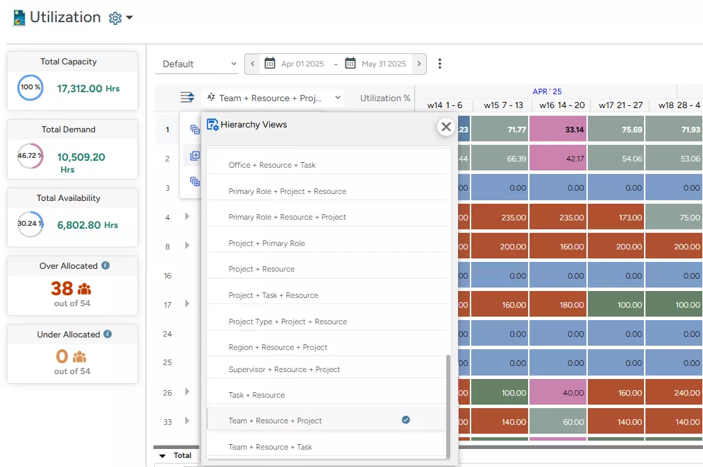
Dimensions
Resource heatmaps can be typically viewed across multiple dimensions such as role, team, department, location, etc. Moreover, using up to three dimensions simultaneously helps decision-makers slice and dice data for granular insight into utilization levels, enabling better decision-making.
Timelines
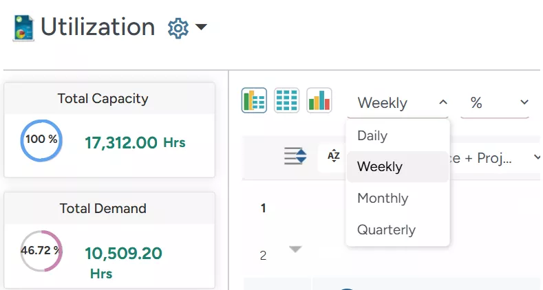
Resource heatmaps can be viewed across different timelines to track current and future utilization trends. Managers can typically switch between daily, weekly, monthly, or quarterly scales to analyze resource-centric workloads over time, which helps plan and maintain optimal utilization levels.
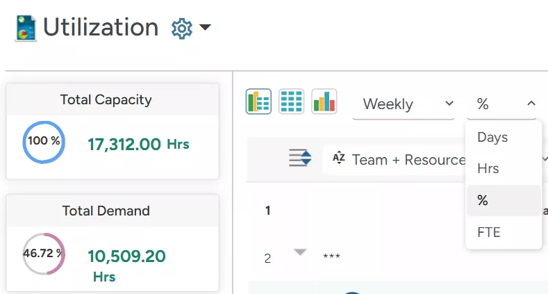
Units
Managers can display utilization levels in different units like ‘Days,’ ‘Hours,’ ‘FTE,’ or ‘Percentage’ based on their needs. This helps standardize reporting and ensures clarity in resource utilization assessment in real-time by presenting data in a consistent format.
Data Format
Utilization levels typically can be viewed in different formats, such as graphical, tabular, or a combination of both, depending on user preference. The data format provides precise numerical values, while the graph format visually represents trends (depending on the graph type) for swifter interpretation and decision-making.
Filter
Filters help narrow down resource utilization data based on specific criteria. Managers can refine views by ‘Resource Name, ‘Location,’ ‘Team,’ ‘Supervisor,’ ‘Job Title,’ ‘Utilization Hours,’ etc., to focus on relevant insights. This enables a targeted analysis of utilization levels across enterprises.
Read More: What is a Utilization Report and 5 Steps to Build an Effective One
Since we now understand the components of a resource heatmap, let’s explore its benefits.
Benefits of Using a Resource Heatmap
Resource heatmaps provide valuable insights that empower managers to optimize workload distribution, boost overall productivity, and maintain a healthy resource index. Below are some key benefits explained in detail.
Easy Visualization Allows Quick Decision-Making
Traditional spreadsheets fail to provide clear, real-time insights into workload distribution across dimensions, such as departments, teams, and projects, all in one place. This fragmented visibility often leads to resource overallocation or underutilization, resulting in missed deadlines, budget overruns, and reduced productivity.
In contrast, resource heatmaps offer a visually intuitive, color-coded view of resource utilization levels, making data-driven decision-making faster and more effective. With a comprehensive visual snapshot, managers can quickly identify workload imbalances, optimize resource allocation, maintain employee productivity, and proactively prevent burnout in real-time.
Read More: Signs of Resource Underutilization and (how to) Course Correct Them
Improves Profitable Utilization
When skilled employees spend a significant amount of time on non-billable/BAU activities, it directly hampers organizational profitability. Similarly, prolonged bench time due to a lack of suitable work opportunities adversely impacts the firm’s top and bottom lines.
However, with comprehensive resource heatmaps, resource managers can identify resources that are not engaged in productive/billable work. Accordingly, they can mobilize benched resources or resources working on BAU activities to billable/ strategic opportunities and boost the firm’s profitability.
Prevents Burnout and Disengagement
Due to a lack of visibility into workloads, managers may frequently over-allocate high-performing employees due to their consistent track record in the past. However, this, in the long run, may result in mental fatigue and employee burnout. In contrast, other team members may feel underutilized due to a lack of sufficient work and may feel disengaged.
By leveraging resource heatmaps, managers can redistribute tasks, adjust priorities, or deploy additional staff to balance workloads effectively. This approach enables organizations to prevent burnout or enhance employee engagement, thereby improving the resource health index.
Read More: Overutilization: 10 Effective Strategies to Prevent It for Maximum Efficiency
Helps Identify Utilization Patterns
Managers must understand how resource utilization varies or fluctuates over time to set utilization targets that are both achievable and aligned with operational realities. For instance, in the audit and accounting industry, during the peak season, an auditor’s utilization levels may exceed 100%.
However, during the lull period, the billable resource utilization may drop to 50%, which is still acceptable considering the cyclic nature of demand. Equipped with a resource utilization heatmap, firms can capture these variations, analyze emerging patterns, and establish standardized, realistic utilization benchmarks to drive optimum productivity.
Maintains Resource Health Index
As discussed earlier, resource heatmaps play a vital role in enhancing workforce productivity levels. It enables managers to apply appropriate resource optimization strategies to prevent workload imbalances and maximize billable utilization.
As a result, it allows organizations to maintain a good resource health index and ensure no one is overworked or underutilized. This helps improve operational efficiency and enhance project delivery, resulting in better client satisfaction and higher business profitability.
Read More: What is Resource Optimization? A Complete Guide to Improve Project Delivery
Now that we have gone through the benefits of using a resource heatmap, let’s see how to analyze one using advanced resource management tool.
How to Analyze a Resource Heatmap?
A 5th gen resource management tool like SAVIOM offers resource utilization color-coded heatmaps that provide foresight into resource utilization rates. These visual cues help managers quickly identify instances of over and under-utilization across roles, departments, teams, and projects.
At the core of the tool is an all-in-one Resource Planner, which allows managers to analyze workloads across the organization. Users can sort data by resource name, region, team, or project to quickly assess utilization and make informed allocation decisions.
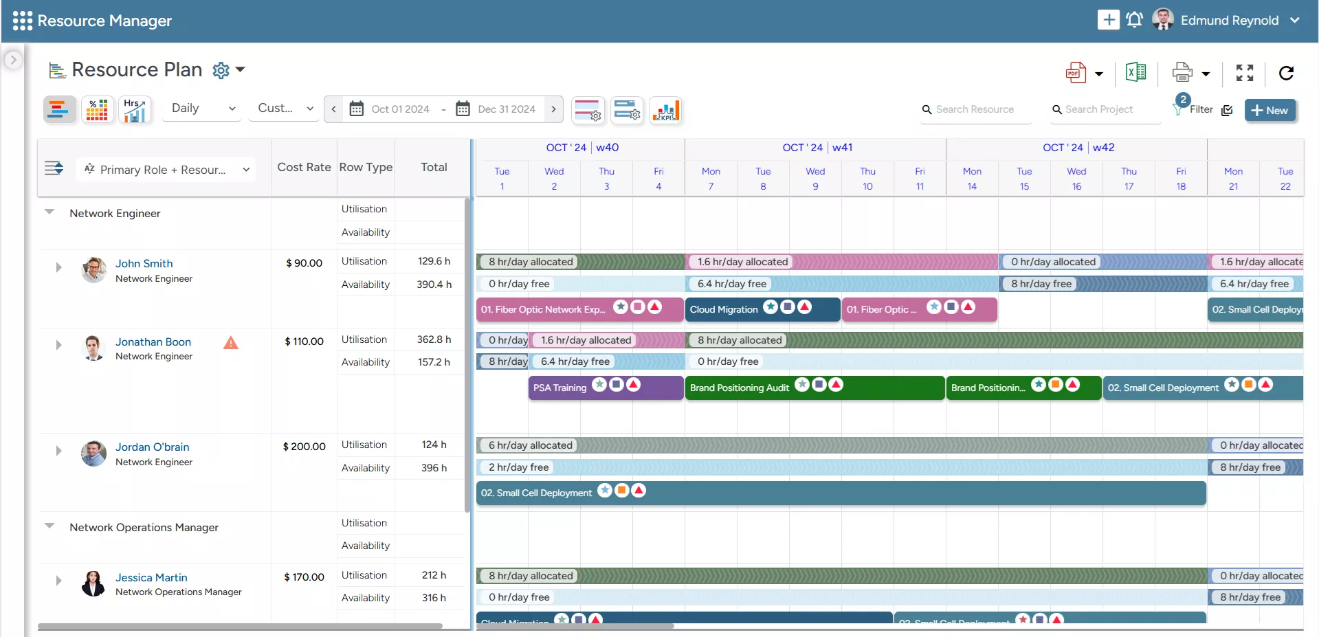
But the tool goes beyond just offering insight into utilization; it also provides a centralized view of resource availability, capacity vs. demand, and more, enabling proactive planning.
However, to access utilization-specific data, users can simply switch to the ‘Utilization Heatmap’ screen to analyze how resources are being utilized across dimensions. Let’s understand it in detail.
Viewing the Report in Tabular or Graphical Format
To start with, the resource utilization heat map can be viewed in various formats- graphical, tabular, or an integrated view combining both. This enables users to interpret insights based on their specific analytical preferences.
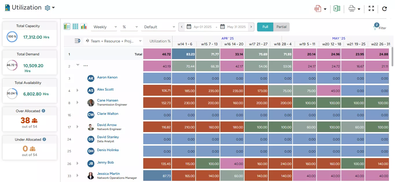
When using the tabular format (as shown above), users can adjust the scale in ‘Daily,’ ‘Weekly,’ ‘Monthly,’ and ‘Quarterly.’ This provides a clearer picture of workload distribution over different periods.
In addition, users can choose the Unit (Days, Hrs., %, FTE) to view the report.
Managers can apply the ‘Group By’ option (as populated in the following image) to organize data by specific dimensions, such as ‘Primary Role,’ ‘Project,’ or ‘Region,’ enabling a multidimensional view of resource usage and availability across the organization. It enables decision-makers to identify where resources are over or under-allocated with work. Accordingly, appropriate measures can be taken to optimize resource utilization.
For instance, in the screenshot below, we can see that Jessica Martin, a Network Operations Manager, is over-allocated in Week 14 of April and only partially allocated from Week 19 through Week 22. In such cases, managers can apply appropriate strategies, such as redistributing workloads, advancing relevant project timelines, or offering excess capacity at a discounted rate to ensure balanced resource utilization.
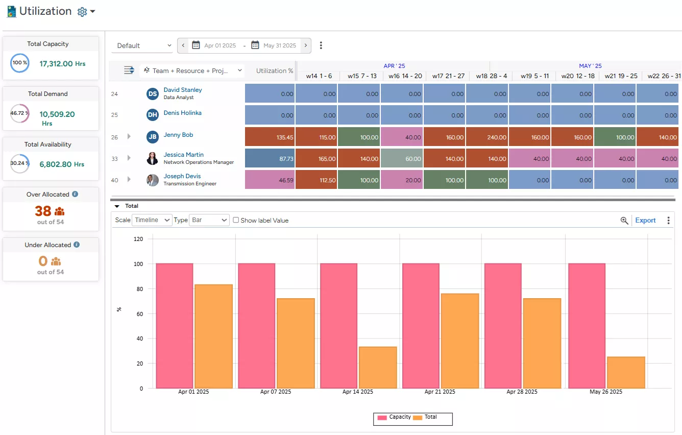
Not just that, users can choose to represent the same data graphically using visual formats like ‘Area,’ ‘Bar,’ ‘Line,’ ‘Point,’ ‘Stacked Area,’ or ‘Stacked Bar’ charts. These visualizations make it easier to interpret trends and patterns across the same dimensions.
Color Codes for Varying Utilization Levels
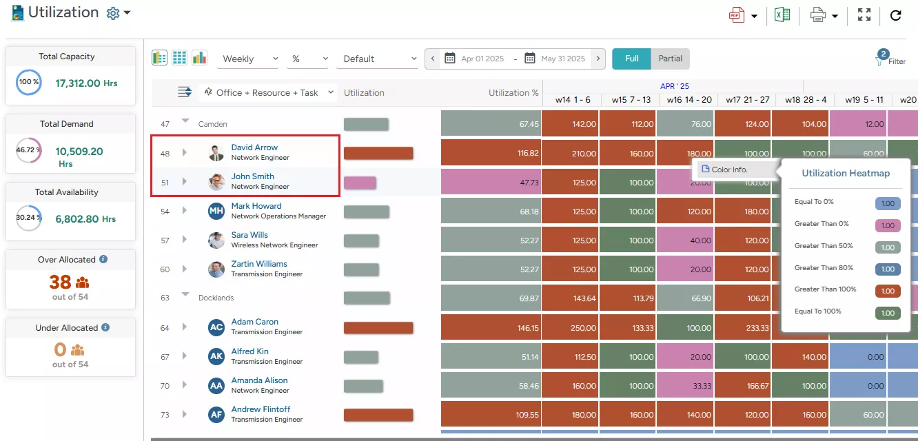
Color-coded heatmaps offer a granular view of the utilization levels of the resources. For instance, in the image given here –
- We can see that David Arrow is being overutilized, as indicated in red, meaning its utilization exceeds 100%.
- At the same time, John Smith is underutilized, marked in pink, reflecting a resource utilization rate below 50%.
Based on this data, managers can take necessary measures to redistribute tasks, adjust project timelines, or mobilize the resource, i.e., John, to billable or strategic tasks to improve overall productivity.
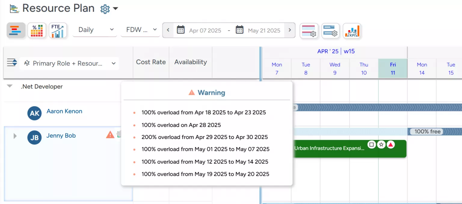
Beyond this, to gauge resource over-utilization promptly, the tool’s all-in-one resource planners also offer an early warning system that instantly flags overutilized resources, displaying the overutilization percentage and the corresponding timeline. This allows managers to take quick action, redistribute workloads, and prevent burnout before it impacts productivity.
Read More: How Can You Make Data-Driven Decisions with Resource Management Software?
Conclusion
A resource heatmap is a powerful tool that brings clarity and control to resource management by offering real-time visibility into utilization patterns. It not only helps identify and resolve workload imbalances but also enables proactive decision-making to optimize productivity and profitability. Moreover, transforming complex data into an intuitive visual format empowers organizations to make informed, timely adjustments, ensuring that every resource is optimally utilized.
The Glossary
Read More: Glossary of Resource Workforce Planning, Scheduling and Management